뉴욕타임즈 그래픽스팀의 뉴욕지리학대회 발표: NYT Graphics team AAG 2012 talk
올해의 미국지리학회 연례학회(AAG Annual meeting)는 지난 2월 24일부터 28일까지 5일간 세계의 수도라고 불리는 뉴욕에서 열렸다. 미국에 있는 동안 거의 한해도 빠지지 않고 참석했었는데 올해는 가지 못했다. 물가비싼 뉴욕 한가운데에서, 그것도 아직 추위가 가시지도 않은 2월이라니 별로 가고 싶은 마음이 생기지 않았다. 물론, 주최측의 입장에서 보자면 그나마 추운 2월이라서 숙박비나 행사장 비용이 상당히 절약되었을 것 같긴하다.
워낙에 대규모 학회이고 다양한 분야의 발표들이 있다보니, 다소간 학문적인 깊이가 떨어진다는 비판이 있기도 하다. 그래서, 나 스스로도 학문적인 목적보다는 미국 여기저기에 떨어져 살고 있는 동문들이나 미국에서 함께 공부한 친구들, 교수들을 만나는 기회로 활용하는 측면이 크다.
관심있게 참석하고 싶은 발표나 행사가 많지는 않은데, 그중에서 만약에 내가 뉴욕에 있었다면 꼭 참석하고 싶었던 세션이 있었다. 이 블로그 포스팅들에서도 이미 몇번 언급된 적이 있는 뉴욕타임즈(New York Times) 신문의 그래픽스 담당부서가 참여한 세션으로 그 부서에서 신문지면이나 온라인신문에 게재하는 지도와 그래픽자료들을 어떤 기술과 절차를 통해 만들어 내는지를 소개하는 세션(Mapping the News in the Age of Visualization: the Art and Science of the NY Times Graphics Department)이다.

아쉬워하던 차에 'GIS Cartography’의 저자인 Gretchen Peterson이 그 발표에 참석했던 후기(Mapping Secrets from the New York Times Graphics Department: Their AAG Talk)를 블로그에 올려놓았기에 정말 반가웠다. 자주 있는 기회가 아닌 만큼, 타자의 눈/귀를 빌려서라도 세션발표 내용을 정리해 둔다.
------------------------------------------------
On Monday of this week the New York Times graphics department gave a talk at the AAG conference to a standing room only audience. The talk, titled Mapping the News in the Age of Visualizations: the Art and Science of the NY Times Graphics Department, was obviously a popular one at the conference so I’ll attempt to summarize some of the things that I got out of it in this post.
세션은 월요일에 있었는데, 주최측에서도 인기를 예상했는지 의자없이 스탠딩룸으로 준비를 했다고 한다.
Of the 22 people in the NYT graphics department, four presented during this talk: . They started by going through a case-study of some of the decision making that has to go on when presenting data visually for the news by describing various ways that the 2008 elections results could be mapped.
뉴욕타임즈의 그래픽스 팀은 모두 22명으로 구성되어 있는데, 그중에서 4명(Matthew Bloch, Matthew Ericson, Archie Tse, and Jeremy White)이 발표를 했다. 주로 이제까지 작업해서 신문지면이나 온라인으로 공개한 지도 중에서 특색있고 조회수가 많았던 것들을 소개하고, 주제선정부터 게재까지의 작업 및 의사결정과정을 설명했다.
First, there’s the typical blue/red by state mapping technique that most everyone is familiar with where states that voted primarily for Obama were colored blue and states that voted primarily for McCain were colored red.
가장 인기있었던 사례로 2008년 대통령선거 결과지도를 소개했는데, Obama가 승리한 주(State)들는 파란색, McCain이 승리한 주들은 붉은 색으로 표시한 단계구분지도(Choropleth map)이다. 군(County)단위의 세부결과도 같이 제공하여 조금 더 자세한 패턴을 볼 수 있게 하였다.


Then they went through slides showing other ways of mapping the data in order to better reflect the population distribution such as taking out all counties where the persons per square mile was less than 3 (colored white), which created a map that showed a more balanced red/blue scheme than the typical map. Also, they tried to extrude cities as 3D bars reflecting population but the New England cities and Los Angeles overwhelmed this map. They tried cartograms but these distorted the geography in the middle of the country so much that you couldn’t tell what color belonged to what city, in, say, Texas. One of the more successful maps was one that depicted party shift from the 2004 election to the 2008 election, shown here:
그외에 소개된 지도들을 소개하면 다음과 같다.
우선, 저밀도(평방마일당 3명이하) 인구지역을 여백으로 표시해서 인구분포지도나 선거결과지도를 조금더 균형있게 보이도록 만드는 기법을 소개하였다. (사실 위의 지도만 보면 붉은 색으로 표시된 지역이 훨씬 커서 공화당 맥케인후보가 우세한 것으로 보일 수 있지만, 인구밀도가 매우 낮은 군들을 제외함으로써 그러한 시각적 왜곡을 줄일 수 있었다는 사례를 보여준 것으로 짐작된다.)
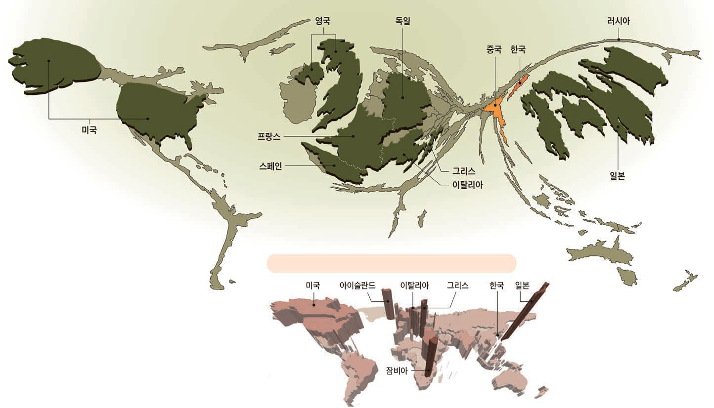
도시인구를 입체기둥형태로 표시하는 3차원지도도 소개했는데, 인구밀집지역인 동부의 뉴욕, 보스턴, 서부의 LA를 나타내는 기둥이 너무 높아서 다른 되들이 모두 난장이로 보이는 지도가 되어서 별로였고, 인구규모에 따라 지도모양을 왜곡시키는 카토그램(Cartogram)도 소개한 모양인데 별로 성공적이지 못했단다. (며칠전(2012.2.29) 에 중앙일보에서 서울대 지리학과 박기호교수와 공동으로 작업해서 ‘나랏빚 세계지도’란 걸 게재했는데 비슷한 사례가 되겠다. 위의 이상하게 생긴 지도가 국가부채규모에 따라서 국가의 면적을 왜곡하여 지도로 그린 카토그램이다.)
오히려 대통령선거 결과를 보여주는데서 그치지 않고, 그 결과를 2004년 선거의 결과와 비교해서 공화당/민주당 우세지역의 변화(Party shift)를 지도화한 시도가 참신하다는 평가를 받았다.

Now, things were moving quickly in the talk and I’m not sure if I’ve got this down right, but there was a map that got a lot of critical acclaim, and I believe it was this party shift map. However (and again, I hope this is the map that they referred to) some did not like the map because it was not the typical election map, supposedly causing some confusion. Thus we arrive at learning point #1:
If you do something differently when people are expecting something that has always been done a certain way, make sure you make it very clear that the map is DIFFERENT. There was a remark that perhaps some day we will teach people that all maps require a certain amount of time for interpretation by the reader, but until then, people may draw the wrong conclusions if they read the map as though it were a standard election map.
지지정당변화지도는 상당히 좋은 시도로 보임에도 불구하고 여러 사람으로부터 비판을 받은 지도 중 하나였다고 한다. 흔히 봐오던 지도가 아니어서, 많은 사람들이 혼동하게 만들었던 듯 하다. (지도는 옆에 있는 범례 (Legend, Map Key)를 보지 않고서도 이해할 수 있는게 가장 좋은데, 그런 면에서 뉴욕타임즈의 지지정당변화지도는 좀 햇갈리는 면이 있다. 보통사람들이 가지고 있는 인식은 ‘붉은색은 공화당지지, 푸른색은 민주당지지’로 굳어 있기 때문이다. 빨강/파랑이 아니라 다른 색깔조합을 썼으면 어떨까 싶은 아쉬움이 있다. 개인적인 생각이다.) 그래서 그들이 얻은 교훈 하나는:
어떤 유형의 지도에 대한 사람들의 고정관념이 있을 때 그걸 뒤짚는 새로은 지도를 소개하고 싶다면, "이건 니들이 보던 그런 보통 지도가 아니야, 뉴욕타임즈 그래픽 장인이 한땀한땀 ㅋㅋ” 설명을 잘 해줘야 한다. 사람들은 여전히 어떤 지도라도 얼핏 보고는 자기들 맘대로 해석해 버리는 경향이 있기 때문에 조심해야 한다.
Before this post gets too long, what I’m going to do is just summarize the rest of what I thought were the major learning points. A lot of these came from the question/answer part of the talk. If you were at that session and want to chime in with other bits that I missed please do so. This is certainly not a comprehensive report on the talk since that wasn’t what I set out to do.
(요기서부터 블로그 저자가 피곤해지기 시작했나보다. ^^) 그 외에 발표중에, 그리고 이후 질의/응답시간을 통해서 알게 된 몇가지들을 정리해보자. 혹시 그 세션이 참가했던 다른 분들이 이 글을 일고 추가할 내용이 있으면 추가해 주시기를 부탁한다.
- They don’t keep a strict style book. It did eventually come out that they do, indeed, have a color book and a typography book with standard color schemes and 15-20 typefaces, but it sounded like they may not adhere (at least to the color styles – I’d guess they don’t have a lot of leeway with fonts) to these very strictly. Regarding the common style found in all their graphics from print maps to interactive maps and data-displays, it sounds like they do quite a bit of review and eventually everyone winds up with about the same aesthetic. It was noted that they strive for a clear and simple presentation.
- 레퍼런스를 위한 색깔표와 서체표를 이용하기는 하지만, 꼭 거기에 나오는 색상/폰트만을 사용하지는 않는 듯 하다. 다만, 생상/폰트스타일 등은 최고품질의 지도제작에 매우 중요한 요소이기 때문에, 상당히 까다로운 심사와 조정과정을 거친다고 한다. 깔끔하고 단순한 스타일을 찾기 위해서 특별히 노력한다도 한다.
- Someone asked what tools they use. I jotted down as many as I heard, though I may not have got them all, here are a few: ArcGIS, Illustrator for the endpoint of all print maps, map publisher, r, various APIs, OSM, TileMill.
- (이건 나도 굉장히 궁금했던 건데,) 어떤 툴들을 쓰는지 질문했다. 다 기억할 수는 없지만, ESRI ArcGIS, Adobe Illustrator, Avenza MAPublisher, 통계도구인 r, 다양한 API들, OpenStreetMap, TileMill 등이 있다. (의외로 오픈소스툴들을 많이 사용하고 있다.)
- They recommend that those who are in college or new to the field learn JavaScript. They also recommend that whatever language you learn, you know enough of the fundamentals of programming to be able to learn a new language in 2 weeks.
- 청중 중에 학생들에게는 자바스크립트를 배워둘 것을 권했다. 온라인지도를 핸들할 때 유용하고, 한가지 프로그래밍언어라도 일단 배워두면 다른 언어를 써야할 때도 적응하기가 쉽다고 덧붙였다.
- Their design process consists of a lot of preliminary sketching. TAKE NOTE!!!
- (이것도 개인적으로 굉장히 중요하다고 생각한다.) 실제 컴퓨터 작업전에 스케치를 많이 한다. 즉, 아이디어를 먼저 세워놓고 지도작업에 들어가는 것이 좋다고 강조했다.
- When asked how they deal with data of high uncertainty, they jokingly answered that they don’t know. Their real answer was something along the lines of omitting that kind of data from the display. What they mean by this, I assume, is if parts of the country (for example) have uncertain election returns, those areas are colored white instead of red or blue.
- 데이터 품질에 대한 확신이 없을 때는 어떻게 하냐하는 질문에 처음에는 농담처럼 모르겠다고 대답했다. 이후 설명을 통해서 짐작하자면, 데이터가 불확실한 지역은 별도의 색(주로 흰색이나 옅은 회색)으로 표시하거나 지도에서 누락시켜서, 지도 왜곡을 최소화한다고 한다.
- There was some discussion on how they serve up their interactive maps. Not being a complete expert in this arena, what I got out of their answer was that they can’t do it the normal way because they have too much traffic. Therefore, they heavily cache the map so that not every single user is getting a fresh call from the database, maybe only 1 out of 20 users is, and the rest are getting snap-shots.
- 지도들이 워낙 유명해지고 인기가 있다보니, 폭주하는 동시접속을 어떻게 관리하는지에 대한 질의/응답도 있었다. 전문가가 아니라서 완전히 이해하기는 힘들었지만, 그들만의 노하우가 있다고 한다. 즉, 동시접속량이 너무 많아서 모든 접속을 지도데이터베이스로 연결하면 서버부하가 너무 크기 때문에, 지도요청의 결과를 대부분 캐시에 저장하고 있다가 스냅샷으로 클라이언트로 보내준단다. 지도데이터베이스 접속시도가 20개 있다면 그 중 하나만 실제로 지도데이터베이스에 연결되고, 나머지는 이미 캐시에 저장된 지도를 받는다고 한다.
For a few examples of great New York Times maps, see this post on.
그외에 뉴욕타임즈에서 만든 다양한 지도들을 더 보고 싶으면, 이 블로그 포스트(Map Elegance: Putting the Data First)를 참고하시라.
-----------------------------------------
이상, 남의 블로그 글 가져다가 내 맘대로 번역하고 생각나는 대로 몇가지 추가해서 정리했다. 몇분 안되겠지만, 혹시 이 글을 읽는 분들 중에 세션에 참가했던 분이 계시면 빠진 부분을 댓글로 알려주시면 정말 감사하겠다. 혹시 동영상으로 찍은 사람이 있어서 유튜브에라도 올려주면 정말 고마울텐데…
출처: Mapping Secrets from the New York Times Graphics Department: Their AAG Talk from [Gretchen Peterson’s Blog]
'GIS 기술' 카테고리의 다른 글
| 지표면 풍향/풍속을 애니메이션으로 보여주는 실시간 바람지도 (0) | 2012.03.29 |
|---|---|
| 논문출간: "Drivers and hotspots of extinction risk in marine mammals", PNAS, 2012 (0) | 2012.02.01 |
| 2012년 미 공화당 대통령후보 경선 진행상황 지도 (0) | 2012.01.31 |